Table of Contents
ToggleWhen Final Fantasy 1 dropped on the NES in 1987, nobody was expecting a visual revolution. What Square (now Square Enix) delivered instead was something far more valuable: a masterclass in artistic constraint. The game’s pixel art didn’t just work within the hardware limitations of the 8-bit era, it transcended them. Every sprite, every tile, every color choice told a story that would influence game design for decades to come. The visual language of Final Fantasy 1 set the standard for how fantasy worlds could feel alive, mysterious, and inviting on machines that technically shouldn’t have been capable of delivering such personality. This deep dive explores how FF1’s art became the blueprint that countless developers still reference today, and why its visual identity remains one of gaming‘s most respected achievements.
Key Takeaways
- Final Fantasy 1 art mastered pixel art by turning hardware constraints into creative tools, proving that limitation breeds visual clarity and distinctive design.
- Character design through silhouette and strategic color differentiation made sprites readable at tiny scales while establishing a visual language that modern games still follow.
- Environmental storytelling in Final Fantasy 1 used monochromatic color palettes and tile reuse to create atmosphere, place identity, and danger progression without additional assets.
- Boss enemy sprites received elevated visual treatment with more elaborate designs and unique color schemes, making them instantly recognizable and story-consequential compared to standard encounters.
- FF1’s UI and menu design integrated seamlessly with the world art through consistent tileset aesthetics and color-coded information, setting a template that JRPGs continue to follow today.
- The artistic principles behind Final Fantasy 1 transcend the NES era and remain foundational to modern game design, influencing indie developers, RPGs, and character design across all platforms.
The Origins Of Final Fantasy 1’s Art Style
Pixel Art As A Technical Necessity
Let’s be clear: pixel art in 1987 wasn’t a stylistic choice, it was the only option. The NES could handle a maximum of 240 × 224 pixels at a time, with massive color palette restrictions. Square’s artists had to work with a limited set of sprites and tiles that could be recycled, reused, and repurposed across the entire 40+ hour experience. This wasn’t a limitation to work around: it was the foundation for a completely different approach to visual storytelling.
The original NES version ran on a 64-color palette, but the displayed color space was even tighter. This forced incredible efficiency in character and enemy design. A single character sprite might occupy just 16 × 16 pixels, leaving virtually no room for detail. Yet each class, Fighter, Thief, Black Mage, White Mage, became instantly recognizable through silhouette alone. The Fighter’s armor profile, the Mage’s iconic hat, the Thief’s slim frame, these weren’t complex renderings: they were visual languages distilled to their purest form.
Background tiles suffered no better fate. A castle room consisted of maybe four to six unique tiles arranged in various combinations. Developers at Square understood that repetition wasn’t a flaw: it was a feature that built visual familiarity. When players saw those brown stone walls and torch sprites, they knew exactly where they were, and more importantly, what kind of challenge awaited them.
Artistic Vision Within Hardware Constraints
Here’s where Final Fantasy 1’s art transcends mere technical limitation: the artists at Square actually used these constraints as creative tools. The reduced palette forced an emphasis on value contrast and silhouette, which meant that even at small scales, characters read clearly on screen. The sprite size restriction meant every animation frame had to communicate motion and emotion through deliberate, exaggerated movement.
Kazuko Shibuya, the character designer for FF1, understood something fundamental: constraint breeds creativity. With limited color options, there was no way to create visual depth through gradients or subtle shading. Instead, the art team used strategic color placement, bright highlights on armor, darker tones for shadows, to create an illusion of dimensionality that shouldn’t have been possible at that resolution.
The backgrounds told a similar story. Dungeons in FF1 use monochromatic palettes for individual rooms, blues for water dungeons, reds for volcanic areas, grays for castles. This wasn’t lazy design: it was sophisticated color theory applied within brutal hardware constraints. The limitation actually enhanced the player’s sense of progression. Moving from one dungeon to another meant a complete visual reset, making exploration feel more distinct and memorable.
What makes this era’s approach fascinating is that the constraints forced artists to be intentional about every single pixel. Wasting space on unnecessary detail wasn’t an option. This resulted in an aesthetic where every element served a purpose, visual clarity, readability, or atmospheric consistency.
Character Design And Visual Identity
The Four Warriors Of Light
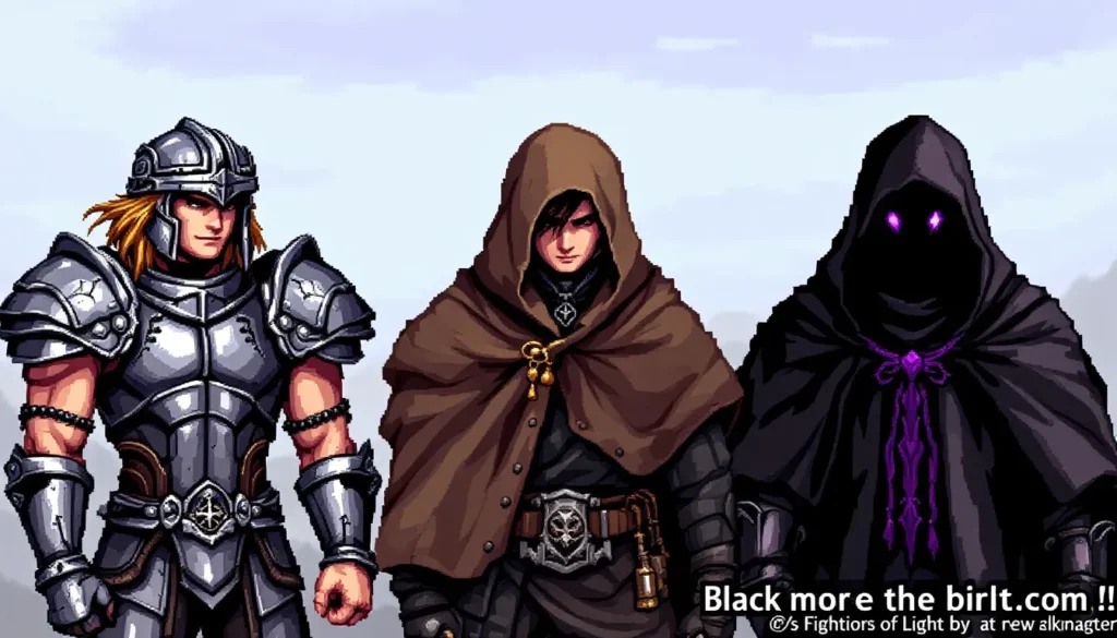
The four main characters in Final Fantasy 1, the Warriors of Light, represent a breakthrough in character silhouette design. Each class has a distinct visual profile that communicates role and personality instantly, which was critical when these sprites were roughly the size of a postage stamp on screen.
The Fighter wears full plate armor with a noticeable helmet, appearing broad and sturdy. Even as a tiny sprite, the armor’s shape and the weapon stance read as defensive and powerful. The Thief has a slimmer frame with lighter armor, suggesting speed and agility. The Black Mage sports a tall, pointed hat that’s become iconic, it’s almost comical in its pointiness, but that exaggeration is exactly what makes it readable at 1:1 pixel density. The White Mage wears robes and a head covering that visually communicates healing and support, contrasting sharply with the Mage’s more aggressive silhouette.
What’s brilliant about this design approach is redundancy in clarity. If players couldn’t read the small sprites during gameplay, they’d reference the menu screen, where larger versions of the same characters reinforced their visual identity. The player’s party screen became a secondary teaching tool for visual recognition, ensuring that even in the chaos of battle, character identification never faltered.
Each class also received differentiated color schemes in their default sprite sets. The Fighter appears in metallic tones, the Thief in darker, earth-toned colors, the Black Mage in dark purples and blacks, and the White Mage in whites and lighter hues. These color associations became so ingrained that decades later, Final Fantasy games still reference this color language when depicting job classes.
Memorable NPCs And Their Design Philosophy
Beyond the main four, FF1 populated its world with NPCs that, even though their tiny stature, managed to be visually memorable. This is where constraint forced absolute genius in character work. The old man in Coneria Castle doesn’t need much, a staff, distinctive robes, and a color palette difference from every other NPC, and suddenly he reads as a wise elder figure. The inn keeper has a different silhouette, different colors, and becomes instantly recognizable as service industry staff.
FF1’s NPC design philosophy avoided the trap of generic fantasy template characters. Sure, guards exist, but they’re given specific visual markers. Merchants have distinct profiles. Magic shop vendors look different from item shop vendors. This kind of visual hierarchy was revolutionary for the time because it required no extra dialogue, no quest markers, no UI elements, just better art.
The genius move was color differentiation. NPCs in the same role category sometimes appeared in different colors to suggest variations in their character or status. A king wears gold-tinged armor, while regular soldiers wear silver. A thief wears darker clothes than a hero. None of this was accidental: it was deliberate visual storytelling that helped players understand the social structure of FF1’s world without exposition.
When players encounter boss characters like Garland or the Four Elemental Fiends, the sprite design escalates noticeably. Garland’s armor is more elaborate, his color scheme more dramatic. The Fiends each receive unique visual treatment, darker, more menacing than standard enemies. This design hierarchy meant players could intuit difficulty and story importance just by looking at an enemy’s sprite, which was invaluable in an era before games hand-held players through every narrative beat.
Environments And World Building Through Art
Castle, Town, And Dungeon Aesthetics
FF1’s world building happens almost entirely through environmental art. Coneria Castle doesn’t need a cinematic or elaborate architecture explanation, the heavy stone walls, the grand staircase tile pattern, and the throne room’s distinctive layout immediately communicate “this is a royal seat of power.” The player instinctively understands the world’s structure through visual design alone.
Towns share similar design logic. Each town in FF1 has its own color palette and tile set arrangement, creating visual distinctiveness without requiring new art assets. The fishing village of Pravoka uses greens and blues to suggest water and vegetation. Cornelia, the opening town, uses bright colors suggesting safety and civilization. Onrac, associated with ice, transitions the color palette toward cooler tones. This wasn’t just aesthetic variation, it was functional game design that helped players navigate and remember locations.
Dungeons escalate the environmental storytelling. The dungeons FF1 throws players into feature increasingly hostile aesthetics. Early dungeons like the Goblin Cave use brown stone and simple layouts. Mid-game dungeons incorporate magma tiles and darker color schemes. Late-game dungeons in the Citadel of Chaos become almost oppressive in their visual presentation, predominantly dark with sharp, angular geometry. The art communicates increasing danger without explicit difficulty ratings.
The tile reuse system that the NES enforced actually strengthens environmental design. Because designers had limited tileset variety, they had to be incredibly thoughtful about which tiles appeared together. A dungeon room becomes distinctive not through thousands of unique pixels, but through intelligent arrangement of a relatively small tile library. This is actually how real graphic designers work with constraints, making every choice count.
Color Palettes And Atmosphere
Color is the secret weapon of FF1’s environmental design. Each major location type receives a distinct color treatment that creates mood and readability. The relationship between foreground tiles, background tiles, and enemy sprites was carefully managed to ensure nothing got lost visually.
This is evident in the contrast strategy: light tiles for enemy sprites to stand out on, darker tiles to create visual interest, and accent colors to guide attention. A green slime enemy needed to contrast against the dungeon background, so sprites were chosen and colored accordingly. This wasn’t random, it was color theory applied with surgical precision.
Water dungeons showcase this perfectly. They use a predominantly blue palette that immediately signals their aquatic nature. The merman enemies appear in complementary colors that make them readable against the blue backgrounds. Torch sprites are rendered in warm colors that pop against the cool water tones, providing visual landmarks and atmosphere simultaneously.
Fire dungeons flip this approach: reds and oranges dominate, with enemies rendered in contrasting purples and dark tones. The magma tiles use bright oranges and reds that heat up the visual temperature. Compare this to ice dungeons, which use predominantly cool blues with highlights suggesting snow and frost. Each environment becomes a lesson in atmospheric color psychology applied under brutal technical limitations.
The genius is that none of this required 3D rendering, complex lighting calculations, or dynamic effects. Just careful, intentional color selection created atmospheres that players still remember viscerally decades later. When someone describes FF1’s dungeons, they don’t reference polygon counts or shader quality, they remember the feeling that colors created.
Monster And Enemy Design
FF1’s enemy roster showcases how far sprite-based design can push visual variety within constraints. The game features around 70+ unique enemies, yet because of sprite limitations, many share similar silhouettes with different colors. This approach turns a limitation into a strength: players instantly recognize enemy types by silhouette, then identify variants through color shifts.
Goblin sprites appear throughout early dungeons in different colors, suggesting different roles (stronger variants appear darker). Giant rats share a common body shape but receive different proportions and colors depending on context. This economy of design allowed Square to populate their world with dozens of visually distinct encounters while reusing base assets.
Boss Battles As Art Showcases
Boss enemies received special treatment that separates them visually from standard encounters. Garland, the first major boss, uses a sprite that’s distinctly different from any regular enemy, his armor is more elaborate, his coloring more menacing, his stance more aggressive. This visual distinction served a mechanical purpose: when players encountered Garland, they knew they faced something different than the goblin cannon fodder.
The four Elemental Fiends, Lich, Marilith, Kraken, and Tiamat, each received completely unique sprites reflecting their nature. Lich appears skeletal and menacing, using dark purples and bone whites. Marilith’s multi-armed design fills the screen space, creating an illusion of size and complexity. Kraken breaks from humanoid design with a creature silhouette, suggesting something genuinely alien. Tiamat uses a dragon design that’s immediately recognizable as the boss threat it represents.
These boss designs did something crucial: they made battles feel consequential. Discussions about game design principles consistently highlight how boss design separates meaningful battles from trash encounters, and FF1 understood this principle years before industry consensus crystallized around it. The visual weight difference between a randomly encountered enemy and a named boss was enormous.
Exiled enemies like the Four Fiends of the Four Chaos represent the visual peak of FF1’s enemy design. Their sprites are among the largest and most detailed in the game, using extended color palettes and complex tile arrangements. Standing beside these creatures in battle, the player’s tiny four-person party seems genuinely threatened, not through explicit damage numbers, but through visual hierarchy alone.
UI, Menus, And Interface Artistry
While gameplay happens in the main window, FF1’s menus constitute a significant portion of playtime, and they received serious artistic attention. The menu system uses a consistent aesthetic that mirrors the main game world, the same tiles, color logic, and visual hierarchy principles apply at this smaller scale.
The main menu presents choices in a text box rendered with the game’s tileset aesthetic, using the same visual language as castle interiors. Equipment screens display character sprites at a larger scale, allowing players to appreciate the art in detail and understand how armor and weapons visually distinguish characters. Item screens list inventory in a clean, readable format that was genuinely innovative for the NES.
What’s particularly clever is how the UI reinforces game information visually. Character stats appear next to larger sprite renderings, helping players understand how their visual changes (equipping heavy armor, for instance) translate to mechanical differences. The spell menus use consistent iconography, magic circles for spells, organized by type and effect category. None of this required complex graphics: it just required intelligent visual organization.
The gold standard for FF1’s interface artistry is the status screen. Here, each character gets displayed at their largest sprite size, surrounded by their current equipment, stats, and status conditions. Visual damage indicators like “Poison” or “Petrified” appear in distinctive colors that match their effect (purples for poison, grays for petrify). Again, this is color-coded visual information design that communicates game state instantly without text parsing.
FF1’s approach to UI set a template that many JRPGs still follow. The menus are functional but also reinforce the fantasy aesthetic. Everything feels like it belongs in the world of Final Fantasy rather than feeling like a disconnected interface overlay. That integration between UI and world art is subtler than many realize, but it’s absolutely foundational to how the game creates immersion.
The Evolution Of Final Fantasy 1’s Art Across Platforms
Original NES Version
The original Japanese Famicom and North American NES release represents the purest vision of FF1’s original art direction. This version contains the raw, unfiltered pixel art that Square created under the strictest hardware constraints. The sprite work is sharp and clean, the color choices are bold and readable, and the overall aesthetic is immediately recognizable as iconic 8-bit fantasy.
The NES version’s color palette is technically superior to the Famicom version due to different video hardware standards, which meant the Western release actually showcased the art slightly better. This happy accident meant that many Western gamers encountered the definitive version of FF1’s visual design, even if they didn’t realize it.
What makes the NES version’s art achievement remarkable is pure constraint. The game delivered an entire fantasy world, castles, towns, dungeons, NPCs, enemies, and bosses, within parameters that modern indie games would find suffocatingly limiting. Yet the NES version remains the reference point for FF1’s aesthetic because the art was created under those exact limitations. The visual language is native to that hardware.
Remakes And Reimaginings
FF1 has been ported and remade numerous times across hardware generations. The original ports to MSX2 and WonderSwan attempted to preserve the 8-bit aesthetic while enhancing visuals slightly, with mixed results. These versions exist in a weird middle space, slightly more detailed than NES but not dramatically different.
The Game Boy Advance and PSP remakes (released in the “Final Fantasy Origins” collection) received upgraded artwork. The sprites were redrawn at higher resolution with more detail and animation frames. The color palettes expanded, allowing for more gradual shading and subtle visual effects. Environments received similar treatment, tiles were enlarged and more detailed, yet the essential art direction remained faithful to the original vision.
The definitive modern version is arguably the version that received completely redrawn sprites and backgrounds while maintaining the classic aesthetic. These versions feel like what FF1 might have looked like if developed on SNES hardware. Characters maintain their iconic silhouettes, but with significantly more detail and animation. Environmental art expands into fuller scenes while keeping the original palette logic.
Mobile versions (available on iOS and Android) attempted to bridge original and modern aesthetics. Some used the original NES sprites blown up to mobile screen sizes. Others received dedicated touch-optimized art. These versions faced the challenge of translating an experience designed for a 240 × 224 screen to devices with vastly different aspect ratios and resolution.
What’s remarkable across all these versions is that FF1’s core art identity remains recognizable. Whether you’re playing the pixelated NES original or a modern remake, you’re experiencing the same visual language. The sprite silhouettes, color choices, and environmental design philosophy transfer across platforms because they’re rooted in something more fundamental than technical specifications, they’re rooted in good game art fundamentals.
Legacy And Influence On Modern Gaming
The influence of FF1’s art approach extends far beyond the Final Fantasy franchise. The game essentially created the blueprint for how pixel art RPGs communicate information visually, and that blueprint still guides indie developers today. When games like Undertale, Chrono Trigger remakes, or Dragon’s Quest XI choose retro-styled graphics, they’re working from principles FF1 established.
Modern developers point to FF1 when discussing how to maximize visual impact within constraints. The game solved problems that still matter: How do you make tiny sprites readable? How do you use color to convey atmosphere? How do you create visual hierarchy without UI elements? FF1 didn’t just answer these questions: it answered them so well that subsequent games largely agreed with its conclusions.
The sprite-based Metroidvania genre owes enormous debt to FF1’s environmental design principles. When developers create dungeon hierarchies or use environmental color to suggest danger levels, they’re following patterns FF1 established decades earlier. The relationship between character silhouettes and player readability that FF1 perfected became industry standard.
FF1’s influence also extends to 3D games. Character design principles from FF1, silhouette distinctiveness, color-coded visual identity, emotional expression through exaggerated animation, transferred directly into modern 3D game design. Modern Final Fantasy games (including recent iterations) deliberately reference FF1’s design language, proving these principles scale across decades and technological generations.
FF1’s legacy truly shines in indie and retro-focused gaming. Developers working with pixel art and constrained budgets turn to FF1 as the textbook example of maximizing visual communication within technical limitations. The game has become less of a historical artifact and more of a perpetually relevant design reference.
Conclusion
Final Fantasy 1’s art represents something that transcends the game itself: proof that constraint breeds creativity, and that smart design choices resonate across generations. The pixel artists at Square didn’t just adapt to hardware limitations: they weaponized those limitations into an aesthetic that remains visually distinctive and functionally superior to countless higher-budget productions.
Everything FF1 accomplished, character recognition through silhouette, atmospheric color work, environmental storytelling, UI integration, works today because the principles were sound, not because the hardware was impressive. A modern player picking up FF1 for the first time immediately understands the visual language because good design doesn’t age: it accumulates relevance.
The game’s artistic legacy extends far beyond nostalgia or historical interest. Modern RPG design, character concept work, and environment art still reference solutions FF1 pioneered. When developers talk about making meaningful creative choices within budget or technical constraints, FF1 is the textbook case study. The iconic pixel legacy didn’t just define a generation of gaming, it established visual principles that define gaming itself.


